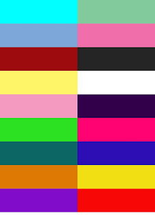
Colour Mood Board
This is a quick standard mood board I created which consists of a fair few variety of dark, bright and bold colours. The whole idea of creating a standard colour mood board was purely to see how each colour could sit together, and when looking at the colours from a distance, how they stand out to one another.
When it comes to thinking about the colour ideas and a specific colour theme for my music magazine, I wanted to have the two standard colours black and white, because both colours sit well over each other and when it came to my questionnaire and audience research they were the most popular colours that my audience wanted to see.
In addition to this, the whole point of a standard mood board was to show the unlimited access to colour for the programme platform in which I am using. I need to consider my colour scheme when it comes to my images that I will be using for my front cover, feature article (DPS) and contents page.
No comments:
Post a Comment